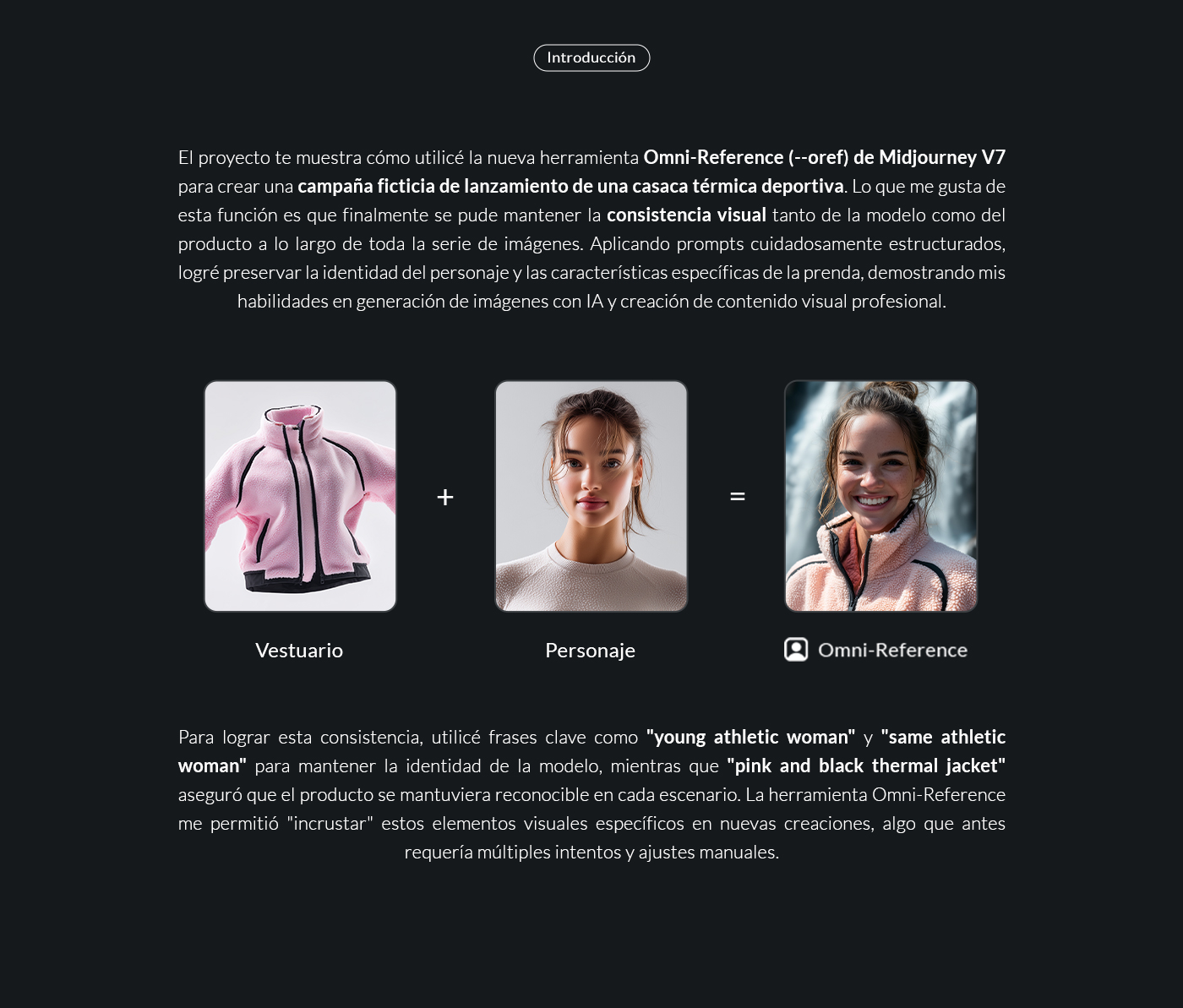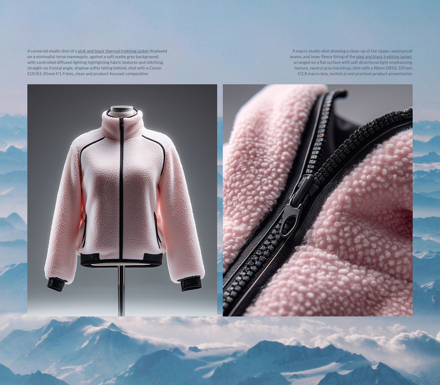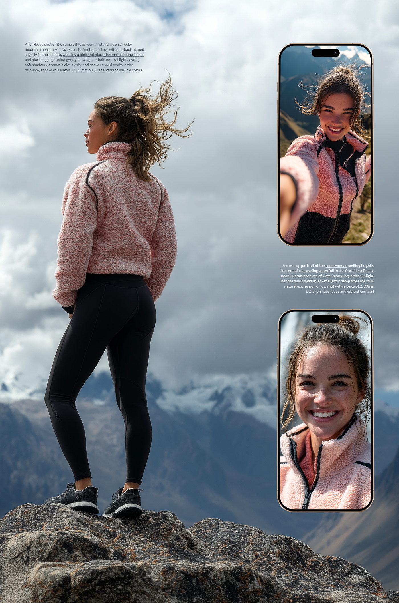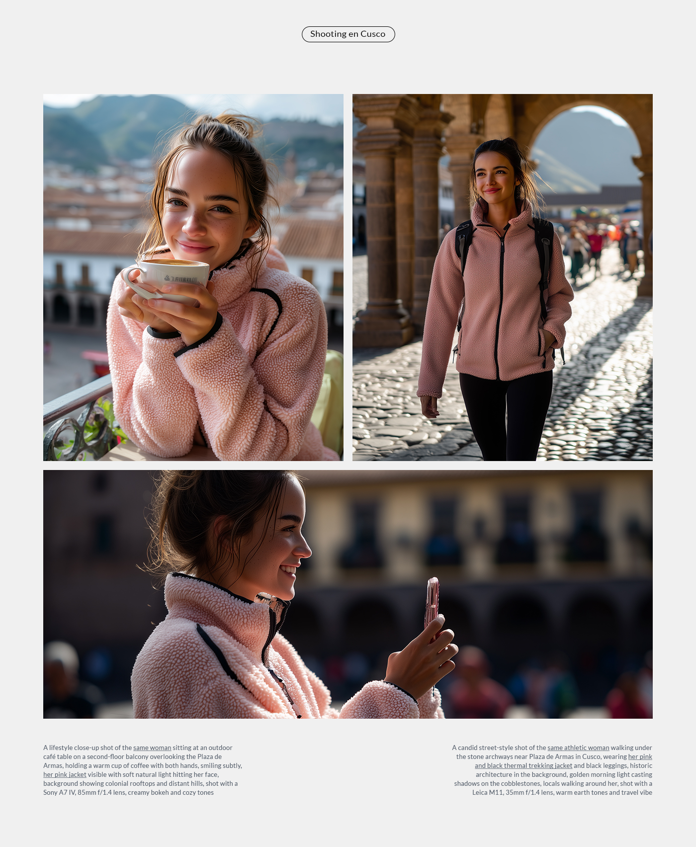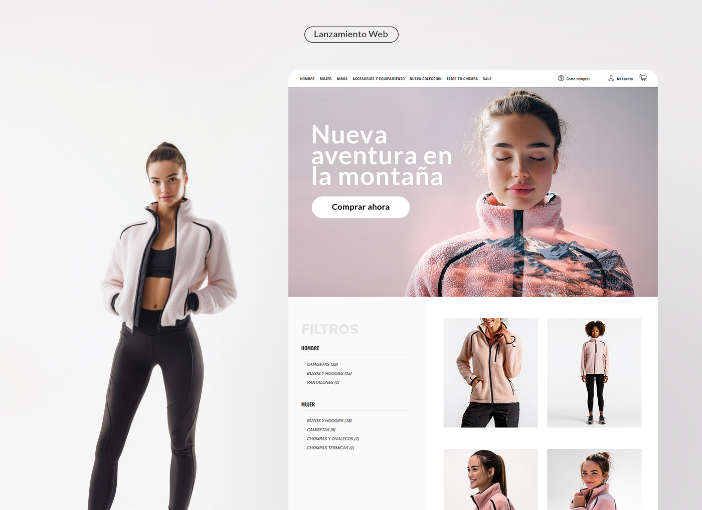
Identidad visual con IA: campaña de lanzamiento
From a neighborhood roaster to a national ritual — a full rebrand built around one idea: coffee is a daily solstice.
The brief
Solstice Coffee had grown from a single Lima cart into 14 cafés across Peru, but the brand still looked like a weekend project. Sales were strong, loyalty was not. They asked for a rebrand that could scale into packaged retail without losing the neighborhood soul.
Strategy
We reframed the category. Coffee shops sell caffeine; Solstice sells a pause in the day. Every touchpoint — cup, bag, playlist, receipt — became a small ritual marker.
- Positioning: "Your daily solstice."
- Audience: urban 25–40, ritual-driven, design-literate.
- Voice: warm, direct, a little cinematic.
Identity
A custom wordmark drawn from mid-century Peruvian signage, paired with a sun-arc symbol that doubles as a coffee crema ring. Palette: bone, ember, deep ink.
What shipped
- Logo system + 3 lockups
- Packaging for 6 SKUs (whole bean, ground, cold brew, drip bags)
- Retail signage kit for 14 locations
- Web + ordering app refresh
- Launch campaign across OOH, IG, Spotify
Results (first 90 days)
- +38% DTC subscriptions
- +22% in-store average ticket
- 4.2M organic impressions on the launch film
- Featured in Monocle, It's Nice That, and Fontstand
Credits
Strategy & creative direction: Juan Pacheco. Design: Studio Norte. Photography: Ana Belaúnde. Film: Cauce.